
 Technical
notes index
Technical
notes indexCREATING WEB PAGES FOR iPHONES
<<previous
page page 2
next
page>>
CONTENTS
1. OVERVIEW & PREPARATION
2. BODY WIDTH
3. THE 'VIEWPORT'
4. AUTOMATIC REDIRECTION
5. THE iPAD
6. 'RESPONSIVE' PAGES
You might think that the iPhone would wrap the text to suit its small screen, but life isn't as simple as that. What you will see if you open that page is shown in the picture on the left, below.
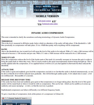

As you can see the iphone will shrink the page to show it in its normal layout, but too small to be legible. You can of course zoom it easily enough, but as shown in the picture above right, it still doesn't wrap the text you will have to scroll laterally to read every line, which is a very uncomfortable reading experience.
So now we need to amend the width of the page to suit the device. Recent iPhones have a width of 414px (older ones have 320 or 375px) (Retina displays have a width of 818 actual pixels, but to maintain compatibility the pixels are doubled in each dimension in Safari and so it reports a width of 414 px).
While it's possible to identify that the request is coming from an iPhone, it's better to detect the screen width and amend the body width to match, so that it will work for any small device.
In order to do this you need to add some code to the header part of the page code. (This, and the other codes in the article, are also available in a zipped text file you can download: it will be easier to copy out the codes from this). Here is the code (obviously you wouldn't include the line numbers, and if you copy this out to a plain text file they won't show):
Line 2 detects the screen width (in the case of a computer this is the screen width, not the browser window width) and sets a property, scrnwt, to it: you could make it screen.width -2 to leave a very slight right-hand margin if you want. (You can name the property anything you like, it doesn't have to be scrnwt.)
Line 3 detects if the screen width is equal to or higher than 795 and limits the body width to 795 so that if viewed on a computer it doesn't spread the lines out excessively wide.
Line 4 writes a 'style' tag specifying the body width, getting the amount from the previous line.
 This demo page has a fixed body width of 320
to show you what the
result looks like when that width is viewed on a computer:
This demo page has a fixed body width of 320
to show you what the
result looks like when that width is viewed on a computer:
<<previous page page 2 next page>>
© Roger Wilmut. Javascript code may be used freely. This site is not associated with Apple.
No warranty is expressed or implied as to the suitability of the quoted code for this or any other purpose.
1. OVERVIEW & PREPARATION
2. BODY WIDTH
3. THE 'VIEWPORT'
4. AUTOMATIC REDIRECTION
5. THE iPAD
6. 'RESPONSIVE' PAGES
Body width
In page one we saw how to modify an existing web page to make the content suitable for iPhones or other mobile devices. The results can be seen here (includes a link back to this page):You might think that the iPhone would wrap the text to suit its small screen, but life isn't as simple as that. What you will see if you open that page is shown in the picture on the left, below.
As you can see the iphone will shrink the page to show it in its normal layout, but too small to be legible. You can of course zoom it easily enough, but as shown in the picture above right, it still doesn't wrap the text you will have to scroll laterally to read every line, which is a very uncomfortable reading experience.
So now we need to amend the width of the page to suit the device. Recent iPhones have a width of 414px (older ones have 320 or 375px) (Retina displays have a width of 818 actual pixels, but to maintain compatibility the pixels are doubled in each dimension in Safari and so it reports a width of 414 px).
While it's possible to identify that the request is coming from an iPhone, it's better to detect the screen width and amend the body width to match, so that it will work for any small device.
In order to do this you need to add some code to the header part of the page code. (This, and the other codes in the article, are also available in a zipped text file you can download: it will be easier to copy out the codes from this). Here is the code (obviously you wouldn't include the line numbers, and if you copy this out to a plain text file they won't show):
<script language="JavaScript1.2"><!-- Hide from
old
browsers
scrnwt = (screen.width)if (scrnwt >= 795) {scrnwt = 795}document.write ('<style type="text/css"> body{ width: ' + scrnwt + ';}</style>')// Stop hiding from old browsers --></script>
Line 2 detects the screen width (in the case of a computer this is the screen width, not the browser window width) and sets a property, scrnwt, to it: you could make it screen.width -2 to leave a very slight right-hand margin if you want. (You can name the property anything you like, it doesn't have to be scrnwt.)
Line 3 detects if the screen width is equal to or higher than 795 and limits the body width to 795 so that if viewed on a computer it doesn't spread the lines out excessively wide.
Line 4 writes a 'style' tag specifying the body width, getting the amount from the previous line.
This demo page has a fixed body width of 320
to show you what the
result looks like when that width is viewed on a computer:DEMO PAGE
It would be reasonable to think that this would now display usefully on an iPhone: but life isn't that simple here either. What you will see is shown in the picture to the right. You can of course zoom it up until it fits the screen width, but obviously what you need is to get it to fit the screen immediately.
To do this we need to investigate the mysteries of the 'Viewport' and this will be examined in the next page.
<<previous page page 2 next page>>
© Roger Wilmut. Javascript code may be used freely. This site is not associated with Apple.
No warranty is expressed or implied as to the suitability of the quoted code for this or any other purpose.